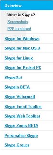
 I took a look at the Skype website this morning and was amazed at how much product there is - maybe too much? Recent months have given birth to a number of new OS platform versions, beta versions of the standard windows version, SkypeIn Beta, Skype Zones Beta, Skype Groups, WeeMees, Skype Buttons - ok, you get my point?
Their web designers and product managers do a good job of laying it out clearly and explaining it well but there is a real danger that Skype ends up running ahead of itself and alienating a growing segment of curious mass-market customers who, as a result of the skype PR blanket, are checking them out and seeing if they "get it" in order to sign-up. Skype needs to somehow seperate the key sign-up benefit and process from the peripheral benefit for the more adept and accustomed user. Maybe they should put the additional product options behind the customer sign-in and match the product placement with the activity profile of the sykpe customer? This way, the prospective new user will clearly understand why and how they should sign-up, and they will be able to upsell more services as customers get more confident and explorational with the service. Ebays 10 years of knowledge in web-apps should be put to good use in doing this.
No comments:
Post a Comment